Did you know that 48% of people cite a website’s design as the number one factor in deciding the credibility of a business? To these people, it doesn’t matter how good your business is or how much better your products or services are than your competitors. If your website doesn’t look the part, they probably aren’t going to give you a second glance.
That’s why it’s so important for all business owners to keep up with modern web design trends. You don’t need to jump on every trend that arises – but staying informed will help you determine whether your website’s appearance could be causing it to lose potential business. We’ve put together a list of trends to keep a close eye on. Check them out below, and get inspired to tackle your web design projects with style.
- Responsive Design: A Great Experience, No Matter Where
Responsive design is simply a way that your site is coded so that the site checks how big of a screen the user has (such as a large monitor, medium-sized tablet, or smaller mobile) and then adjusts how the site looks based on that. This means that no matter whether your customer is having a quick browse on their phone while in line at the grocery, or spending quite a bit of time on your blog while relaxing on the sofa on their tablet, they have a great browsing experience.
If your website technology doesn’t allow for responsive design, it’s time to start talking about an upgrade to a platform that does. Otherwise, you’ll start to see a decline in engagement – customers now demand a great experience no matter the device.
- Minimalism: Get Your Message Across, Quickly
Just like in fashion, web designers tend to go through a lot of fads – specifically color schemes and font choices. However, we’ve noticed that more and more website designs are converging on a theme of minimalism. Less colors, but more meaning behind each color choice. Remember, the purpose of your website’s design is to support your brand and brand message. That’s even more important these days, as many customers’ first interaction with your company is now often via your website.
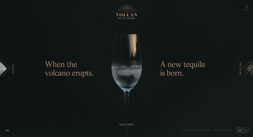
Take a look at how Volcan uses a minimalistic design on their webpage but still manages to make a statement.
With the web being so over-saturated (and consumers being over stimulated), you should ask yourself: what message do I want to send to my consumer at first glance? More critically, what’s the extra fluff that’s getting in the way of that message?
- Video: Share Your Story, Interactively
Already a well-established trend, video maintains popularity, both as content and hero-sized backgrounds. Marketers love video backgrounds because they make websites look modern and create a sense of artistry that static background images simply can’t match up to.
Many website conversion experts and regular people alike see that their visitors stay on their websites for longer and are more likely to sign up or opt-in to their product/service offerings. Video backgrounds work for all professional websites, whether you are running a clinic, design agency, or chicken farm!
You can use a video background to show clips of the life of your staff or even the process of helping a customer. This gives your potential clients/consumers a chance to get to know you before even talking to you. It also paints a very vivid visual representation of what they can expect to experience from your business.
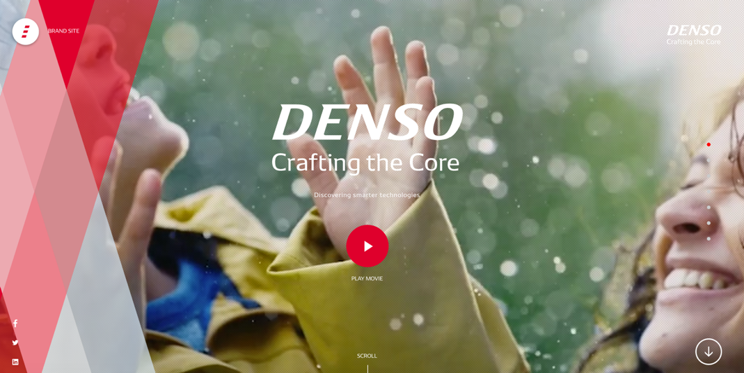
Denso is a leading supplier of advanced automotive technology, systems and components for all the world’s major automakers. Notice how they mix video clips of people running and smiling, with clips of riding in luxurious cars surrounded by beautiful scenery. This helps create a feeling of happiness and bigger opportunities– basically how Denso can promote change in your life, ‘from the core’.
Video Backgrounds also work very well if you are selling products. Create a video that shows people using your product, so they can visually experience the act of using it.
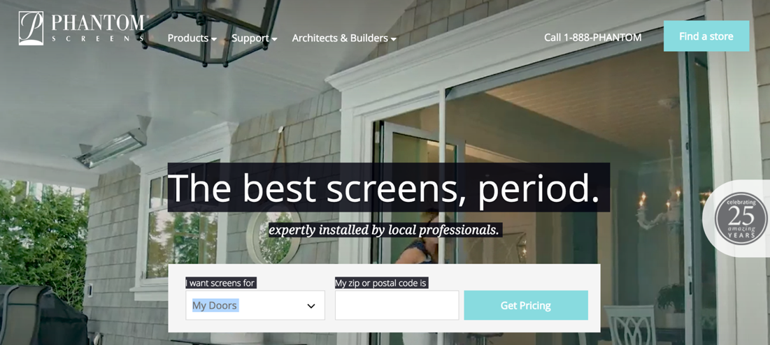
Take a look at how Phantom Screens does it.
The key here is to inspire the type of life your customers could have if they purchased and used your product. By showing them a certain lifestyle, you make them want what you are showing them. Classic marketing 101 stuff. Basically, you’re already convincing to them before they read a single word on your website!
- Cinemagraphs: Bring Your Page to Life, With Slight Movement
If you want to find a happy medium between static images and video, try the “non-video,” when a predominantly still image features only slight movement to distinguish it as a video. Not quite a photograph, not quite a video, cinemagraphs are natural eye-candy because they fool the viewer just long enough to make them take a second look. In the A.D.D. era we live in today, anything you can use to make a user pause — even for just an instant — counts as a small win for one very important reason: You’ve got their attention.
Cinemagraphs usually have a gif format and are very easy to install on your site. The main difference of cinemagraphs from conventional gifs is the subtleness of movements with just one element brought to life. Unlike with gifs, your eyes do not get tired of looking at cinemagraphs. Don’t believe us? Take a look at this example here.
- Bold Typography: Make a Statement, At First Glance
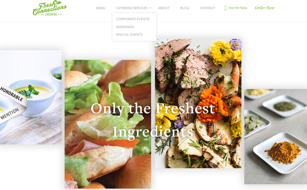
Typography represents another opportunity for a brand to convey its message. While “big and bold” has been in-style for some time, today’s designers are taking things a step further by experimenting with custom-drawn fonts and new on-page placements that really create an impact.
Take a look at Fresh Connections Catering Page.
Conclusion: Know The Trends, No Matter Who You Are
The website trends above are being used by companies that aspire to engage their audience and tell a story. Whether you’re looking to really ‘wow’ your audience or are just looking for a few new ideas, we hope this blog post inspires you to get thinking about how you can really implement great web design. Not sure where to start your redesign project, or if you’ll need the help of an agency? Call Chime!

